➀ Overview
NAKT is a Techno Fashion Label in Berlin that originated from the local underground techno scene. The NAKT signature look – defined by hard cuts, obscure minimalistic designs, slick metal chains and striking iron buckles – is heavily influenced by industrial nuances. They aspire to become a vital part of raver’s nightlife journey.
➁ GOAL
A comprehensive visual development across multiple platforms, translating their sleek, industrial, and underground style into an attention-grabbing graphic design language that strengthens their online and offline presence.
➂ APPROACH
Logo design – Geometric logotype with sharp cuts. A heavy, technical, industrial feel with a sense of rhythm, enhanced by the subtle diagonal offset.
Video postproduction – Applied a grain effect to enhance lower-quality videos, aligning with the raw, underground rave aesthetic. I paired this with sleek typography for added visual impact.
Apparel graphics – Combined photography with flat vector design to achieve a unique contrast.
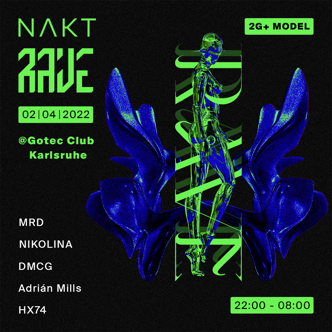
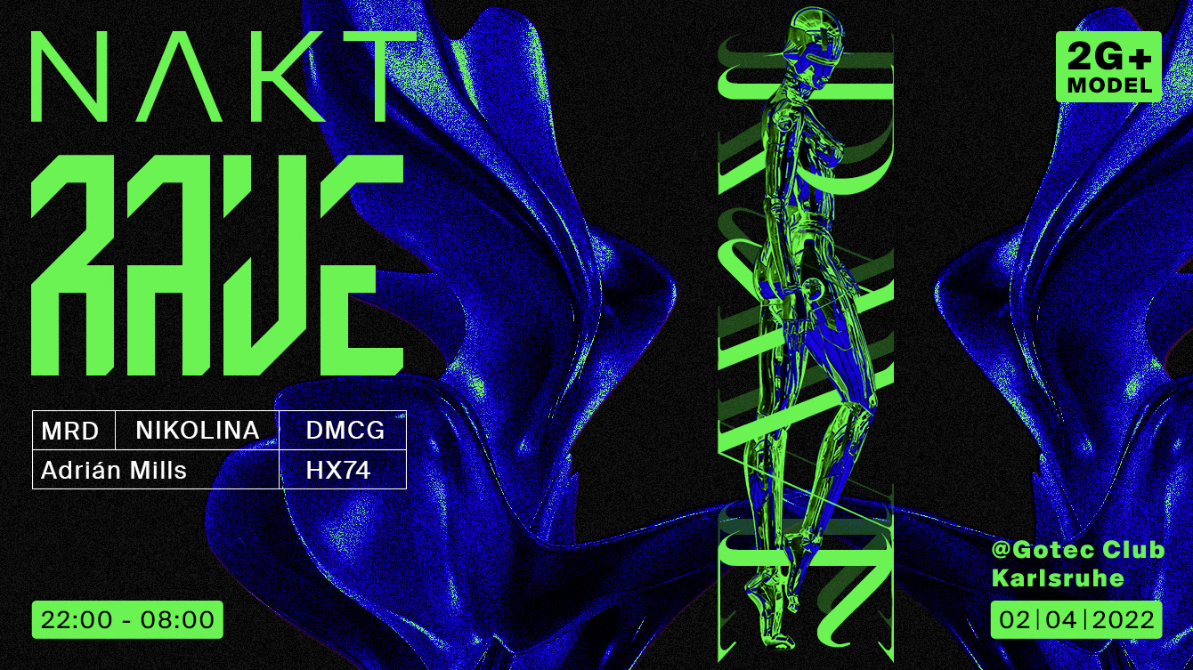
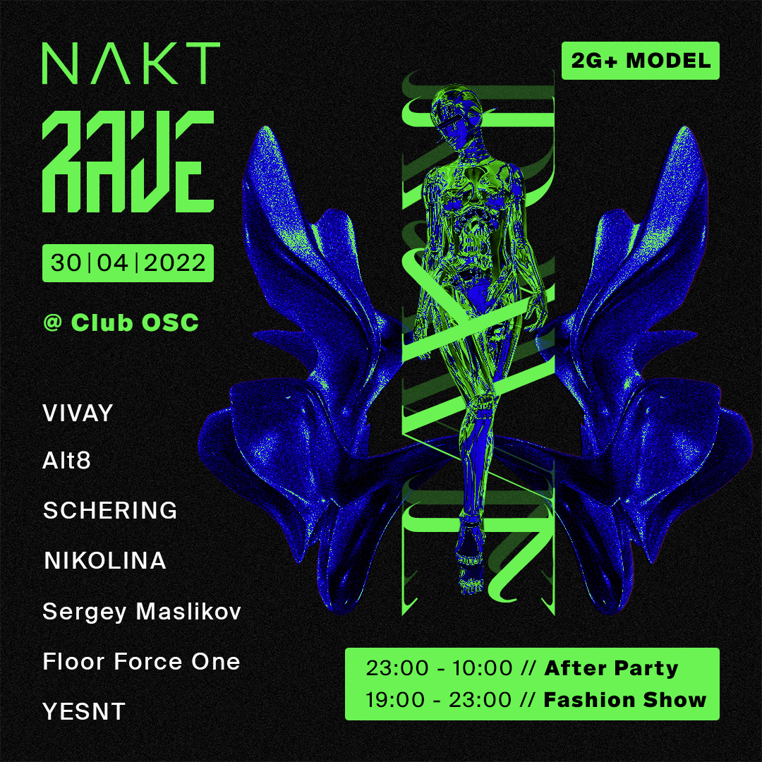
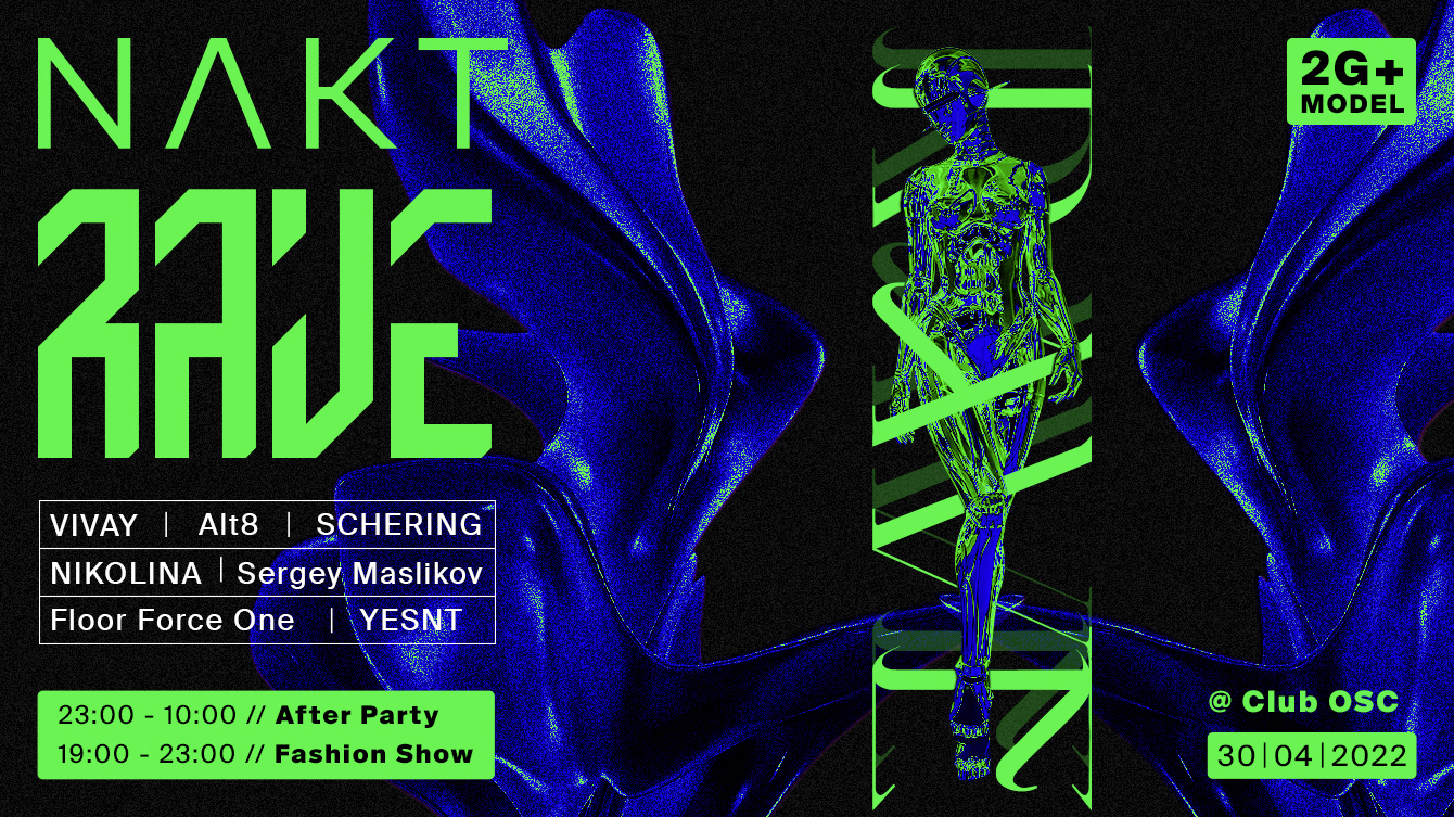
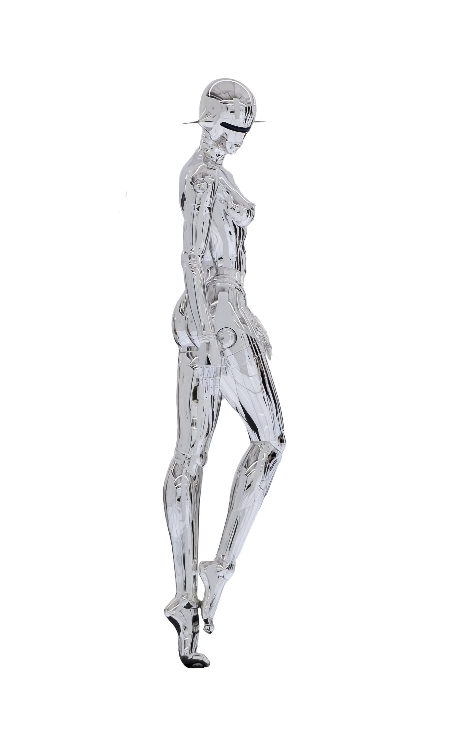
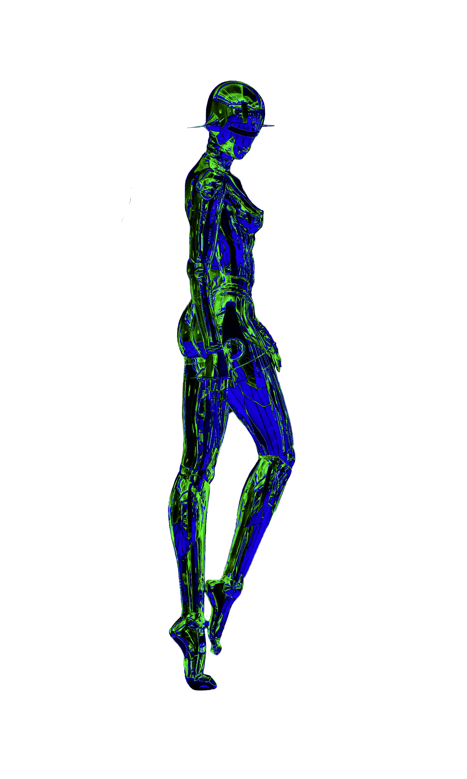
Digital illustration – Acid design style illustrations with neon colors for event promotion.
NEW COLLECTION // CONCEPT (01)
I aimed to visually convey how ravers become one with the music, fully immersed in the sound. To bring this idea to life, I took close-up shots of body parts (model: Charlie), inspired by the aesthetic of vintage medical anatomy books. Instead of labeling these parts with their original Latin names, I replaced them with terms related to electronic music, blending the human form with the essence of the music. Showing skin through photography adds a sense of intimacy and closeness.
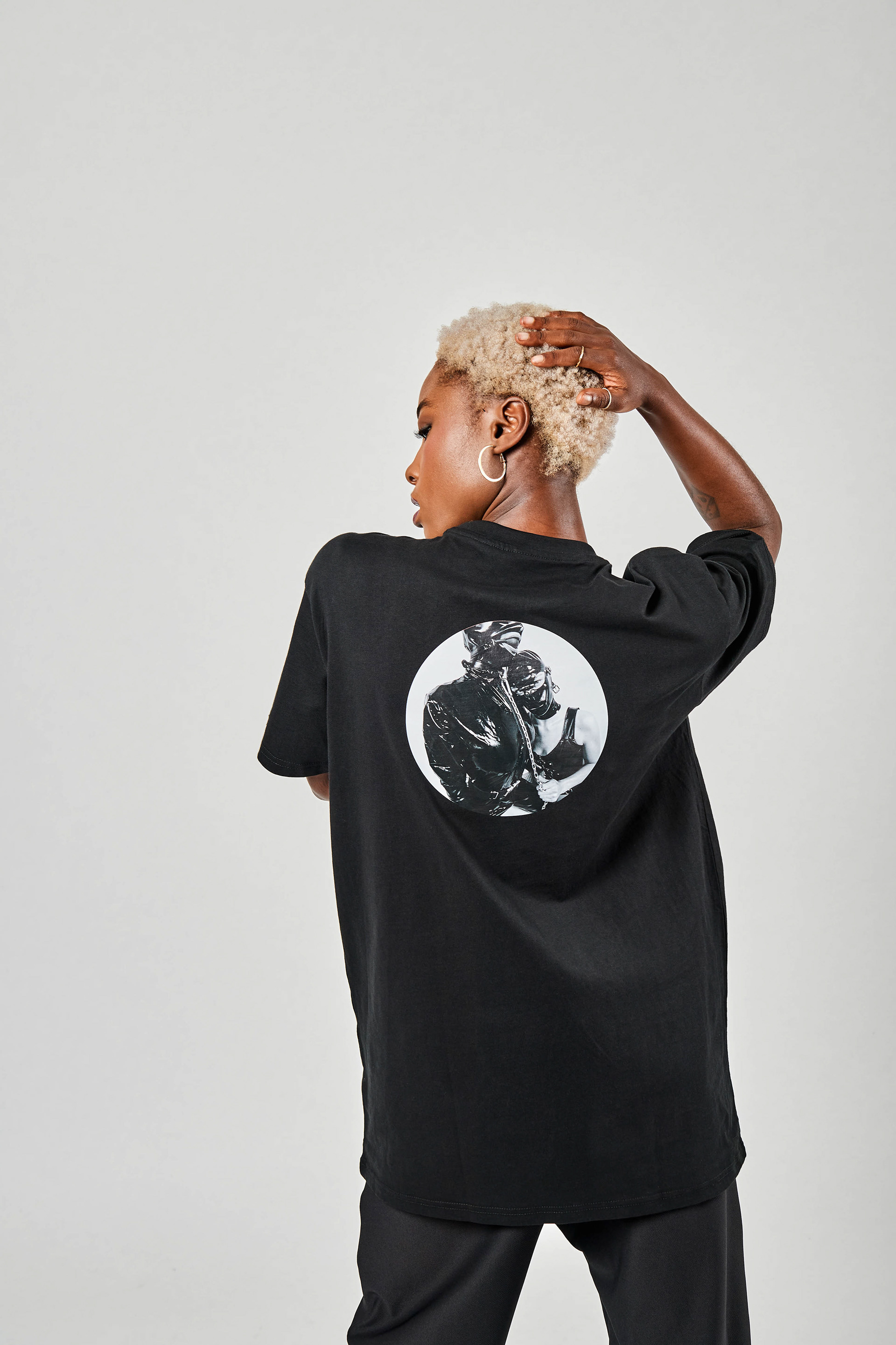
Graphic design: Nana Masilo. Photography: Knut Pflaumer.
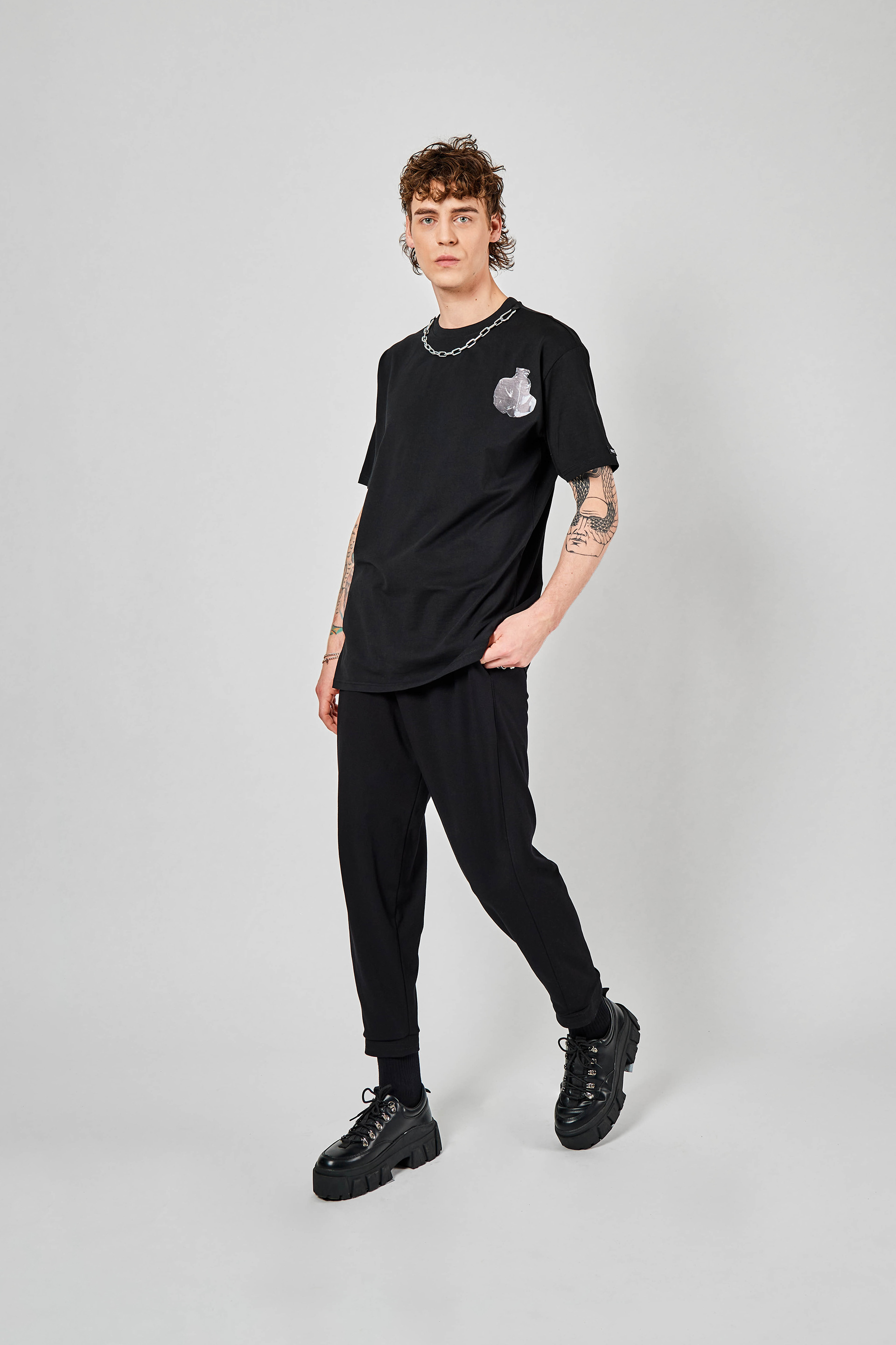
Graphic design: Nana Masilo. Photography: Knut Pflaumer.
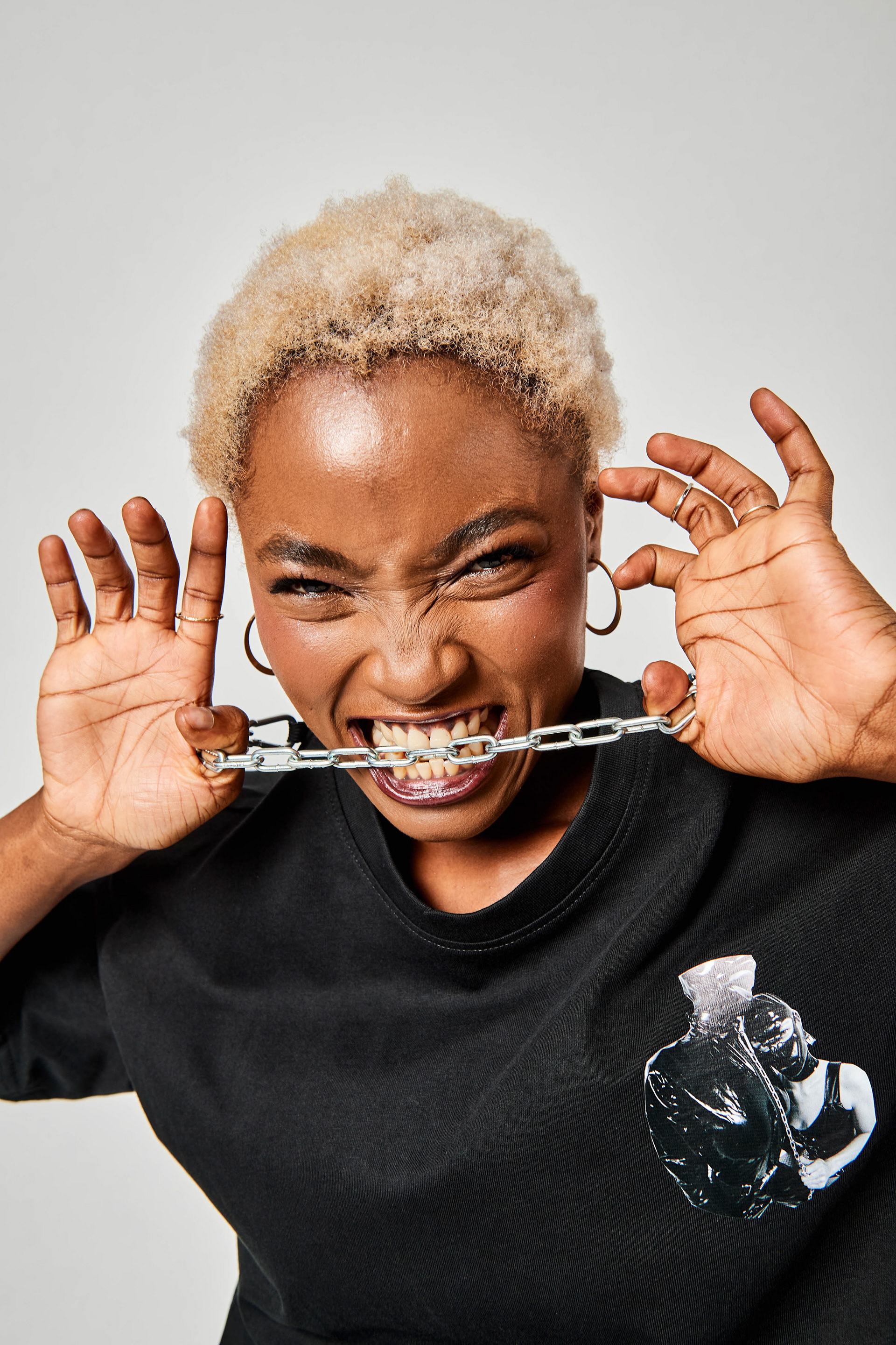
Graphic design: Nana Masilo. Photography: Knut Pflaumer.
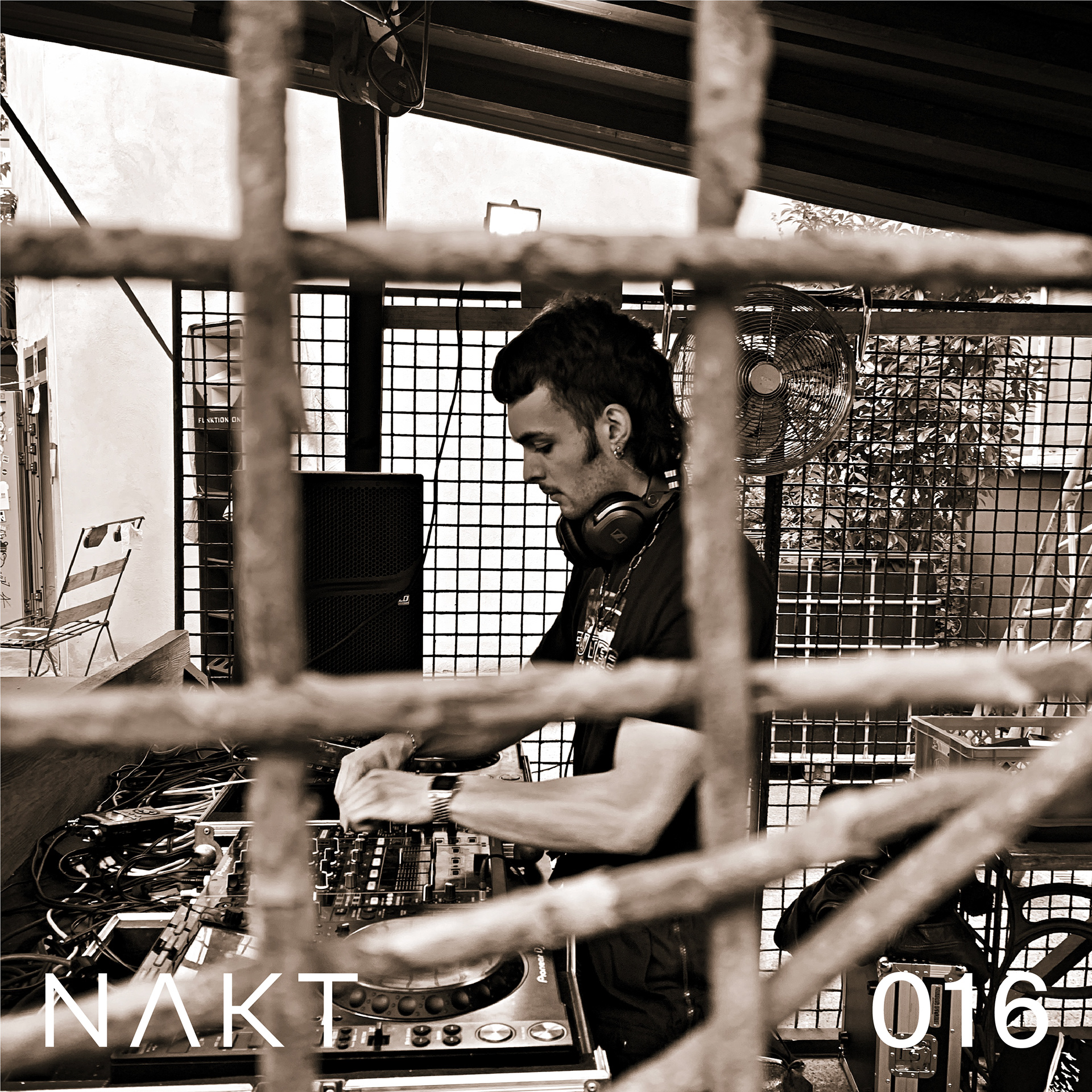
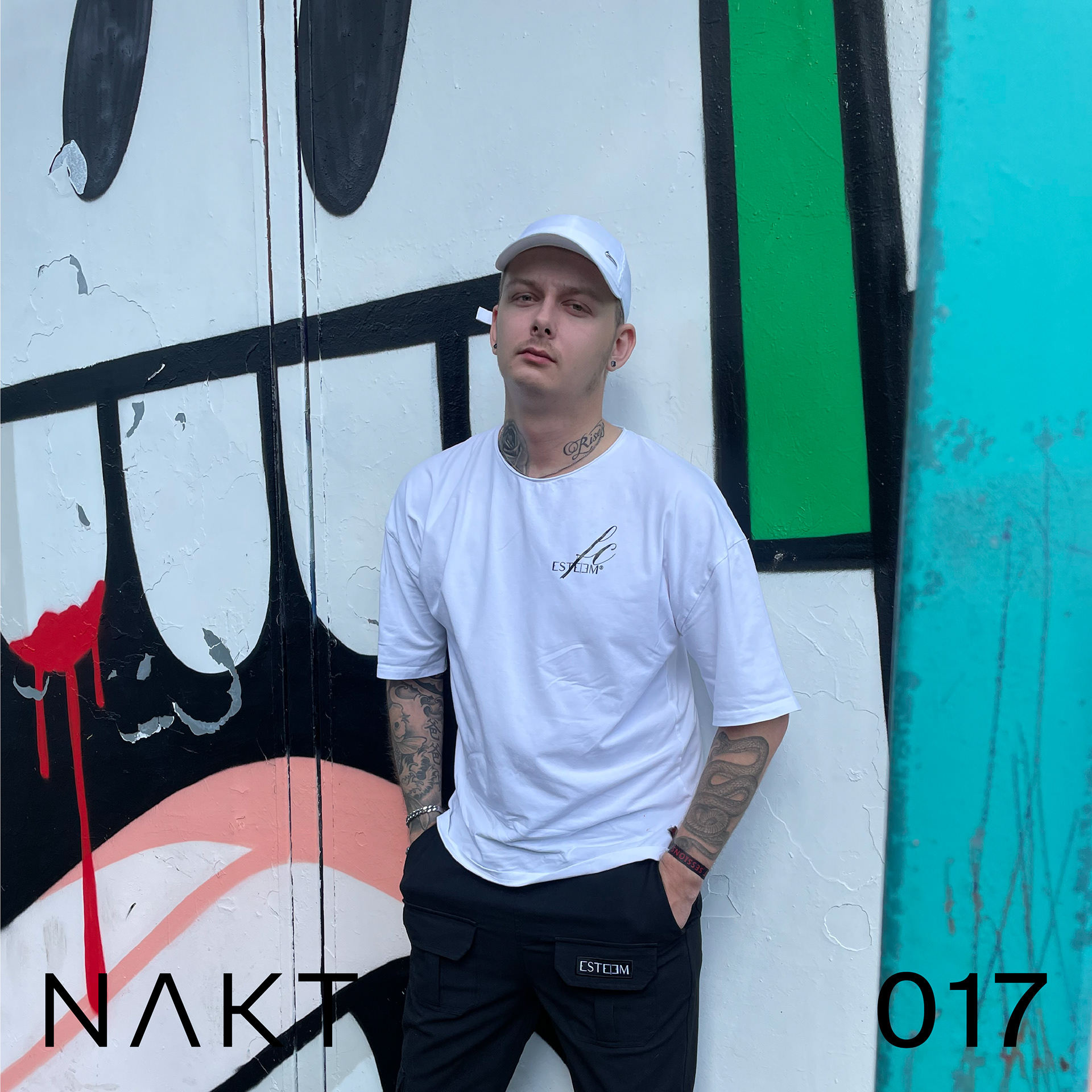
Dj-s // soundcloud (02)
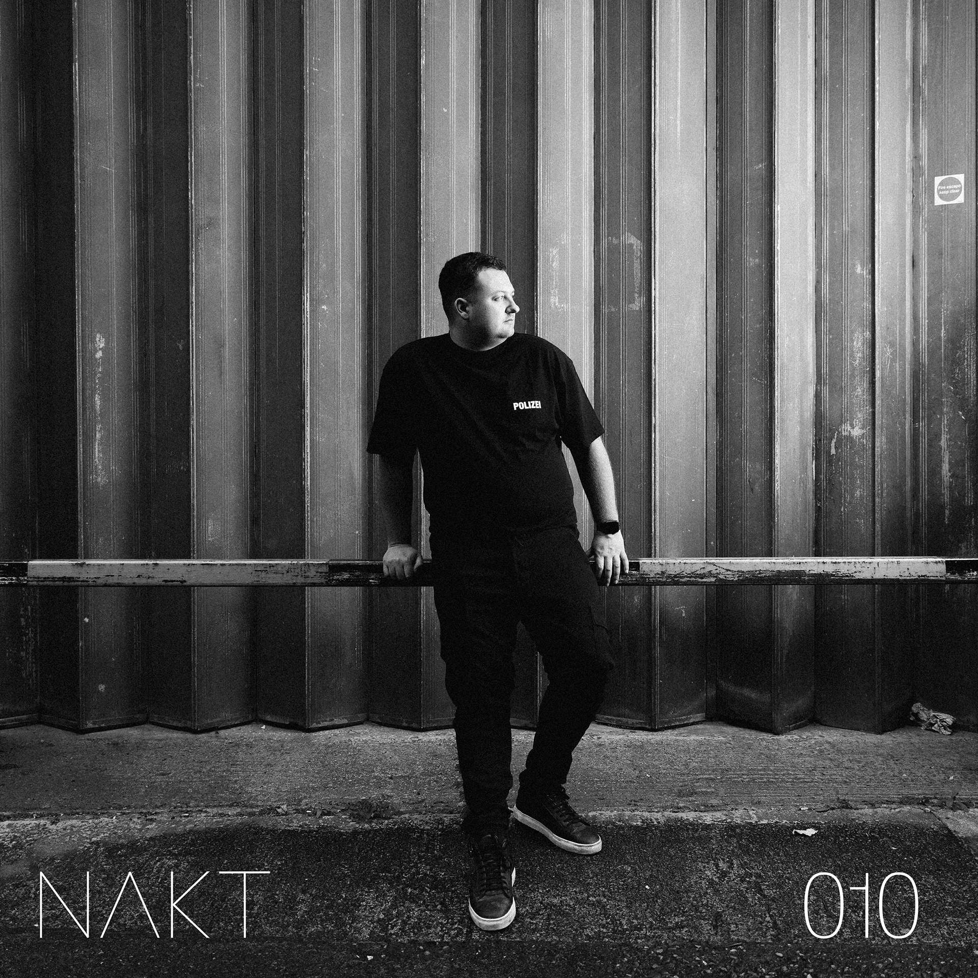
DJ 1
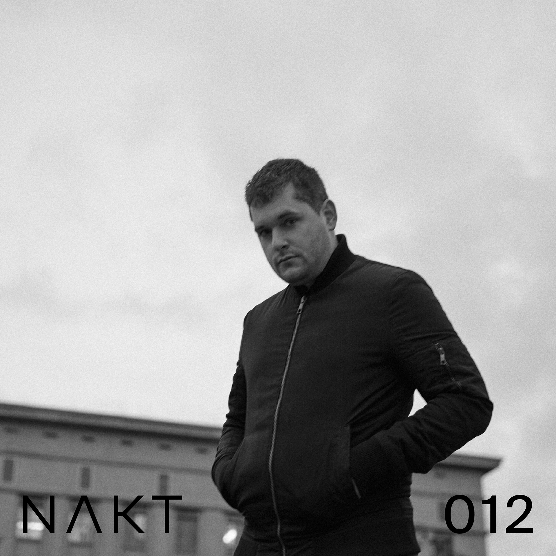
DJ 2
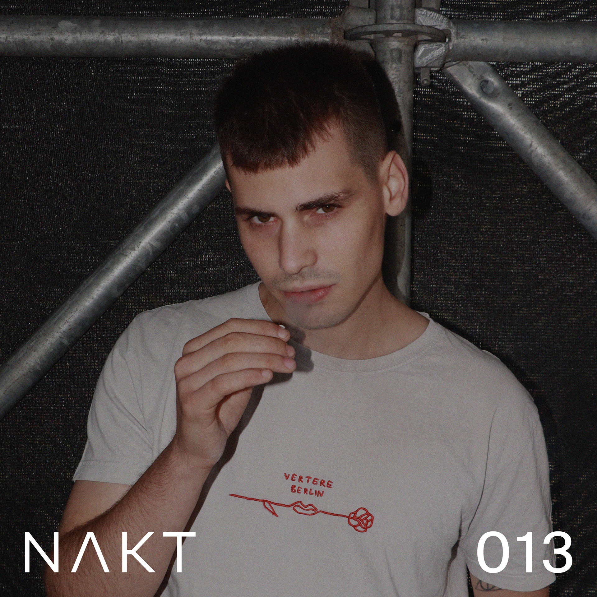
DJ 3
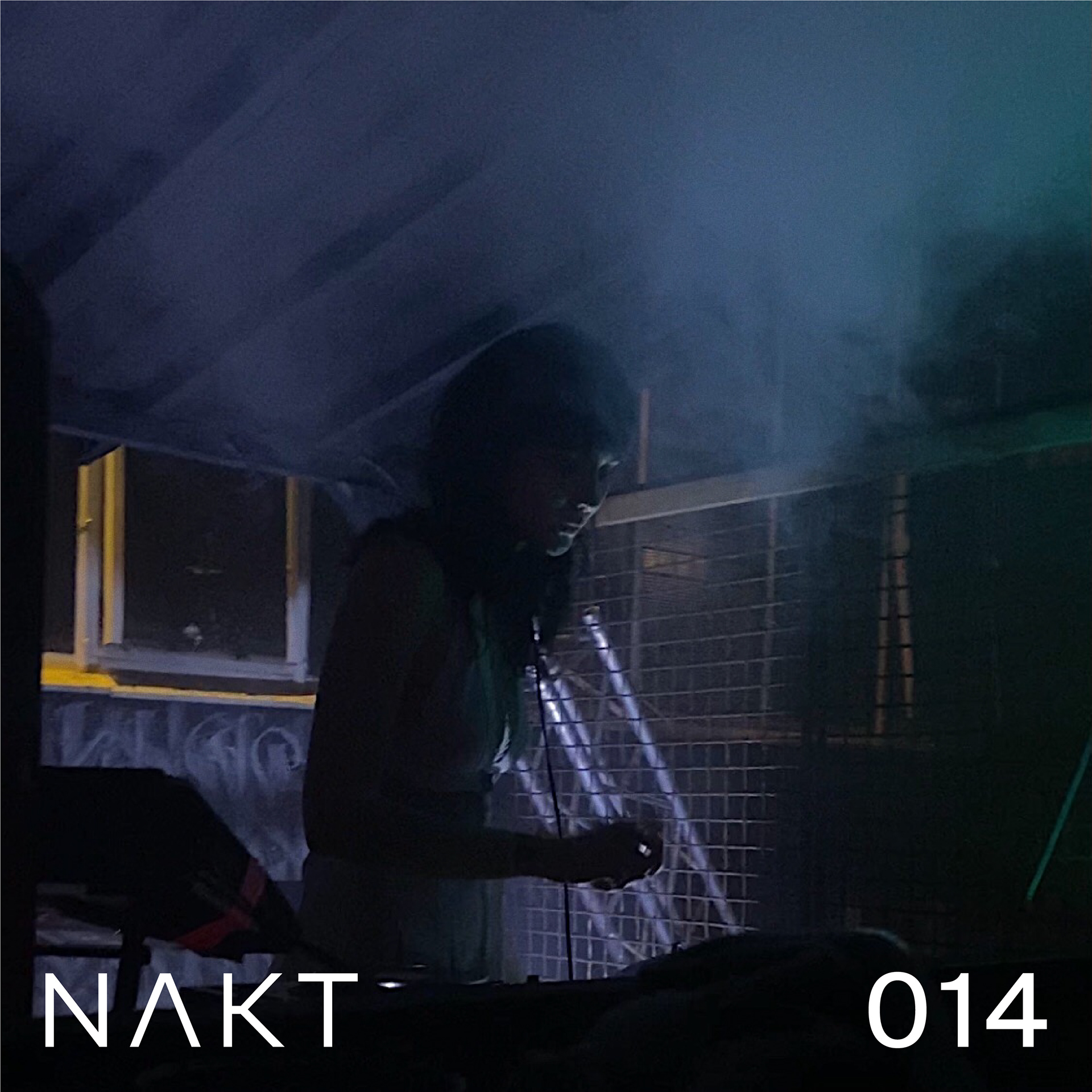
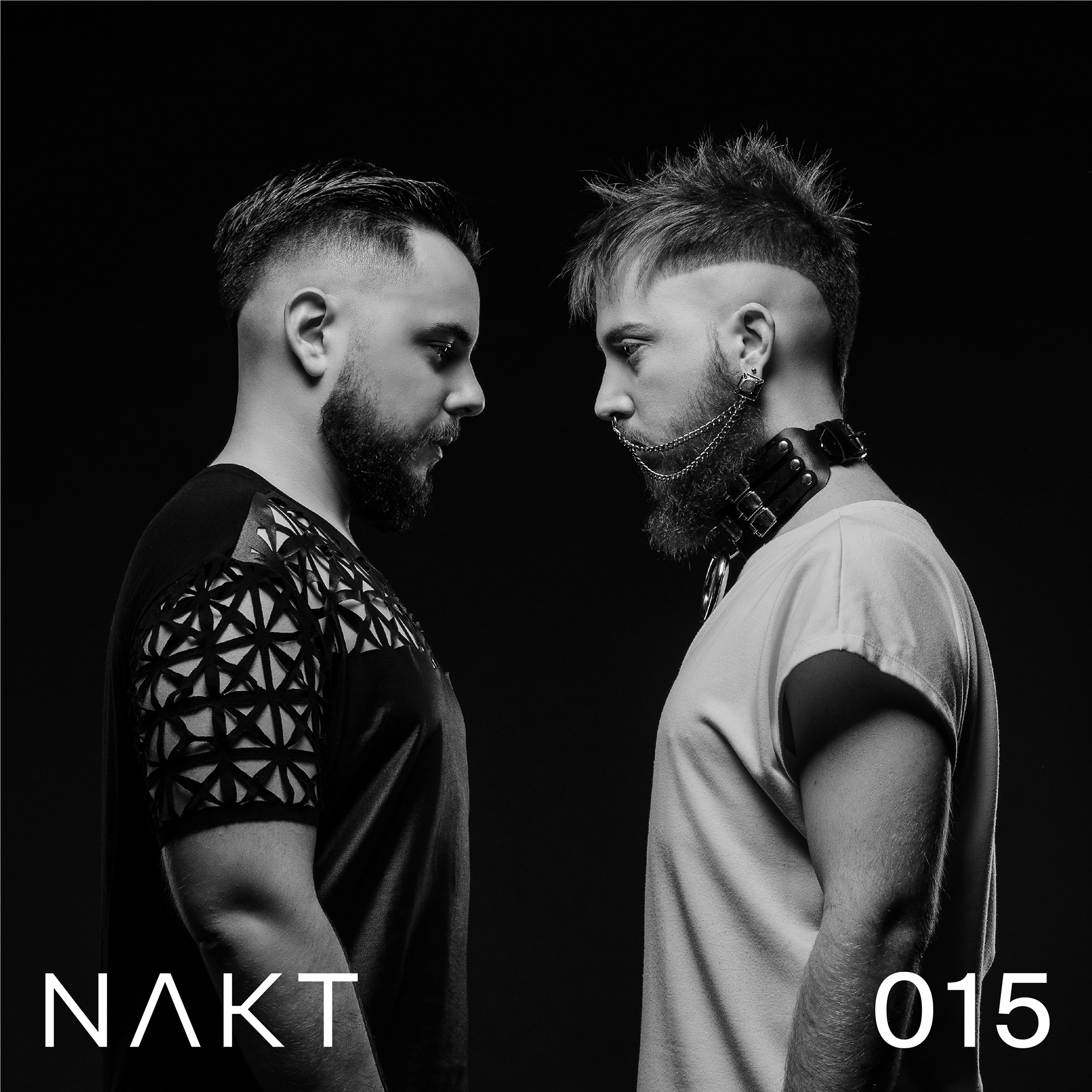

EVENT // social media (03)


digital illustration // event IDENTITY (04)
I took a different direction in response to the studio's request for a renewal of the event promotion. I see contemporary acid design as a strong match for the brand. Rooted in the underground club scene, it features experimental typography, highly saturated neon colors, and trippiness. This style blends the nostalgia of ’60s psychedelia and ’90s acid house, drawing inspiration from vintage rave and techno flyers, as well as elements of spirituality, sci-fi futurism, and cyberpunk aesthetics.
I took a different direction in response to the studio's request for a renewal of the event promotion. I see contemporary acid design as a strong match for the brand. Rooted in the underground club scene, it features experimental typography, highly saturated neon colors, and trippiness. This style blends the nostalgia of ’60s psychedelia and ’90s acid house, drawing inspiration from vintage rave and techno flyers, as well as elements of spirituality, sci-fi futurism, and cyberpunk aesthetics.
